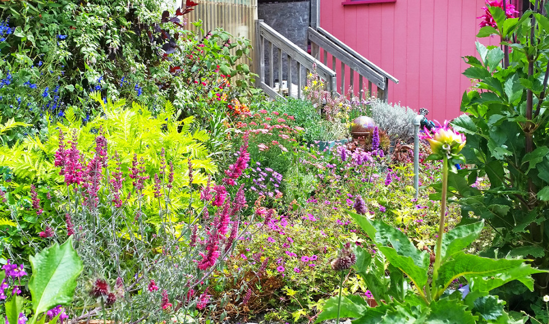
Justafewdahlias I also think you don’t really know what kind of flower you will like till you see it in person
So true! There’s the obvious issue of cameras not catching true colors. But I’ve also had the weird experience of being totally in love with a flower from a photo, and then seeing it in person and thinking “well, I do still like that color, but not on a 10” flower!” Or, the opposite “such a great color - it’s a pity the bloom is so teeny tiny.”
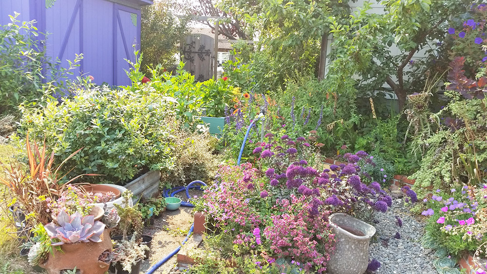
Regarding “muddy” colors…. I think the critical difference is the way people view flowers as a part of overall design. The bridal industry drives so much of how Americans view floral arrangements. In the bridal industry, flowers are supposed to enhance but definitely not take center stage, so muted colors and pastels make sense. I would say event arrangements in America have a similar tendency. I think we have this idea of flowers (especially arrangements from a floral designer) as being an excessive, unnecessary luxury. We want them, but don’t want them to stand out. We feel guilty that they’re so impractical. I think this guilt over the impracticality of art is a uniquely American sentiment.
People feel much more free to pick up a gaudy bright bouquet that will catch everybody’s eye at the farmer’s market for $20. It’s a much less guilt-inducing luxury. So I guess I’m saying I think America’s interest in flowers that fade into the background of design has a lot to do with the “Protestant ethic and the spirit of capitalism”….
It holds true for design in general. America is drab. Compare an IKEA store to Restoration Hardware. Bright colors are pretty taboo here - it goes all the way back to the pilgrims. There a reason the bright colors of both the sixties and the eighties are associated with youthful rebellion.
I’ve only had one cup of coffee this morning, so this may not be as insightful as I think it is, but…